This week’s assignment was to find examples of ineffective signage around our neighborhood and then to redo one as an example. Here’s what I found:
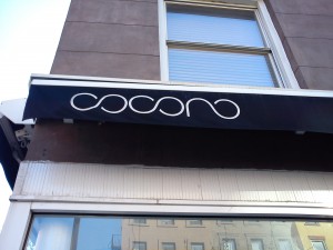
Some signs were very hard to read like the one below. What’s the name of this salon? I have no idea.
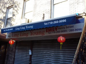
Then there were signs that were crammed full of words. What is “EMILY” up there for? Why is it covering the address? Just confusing.
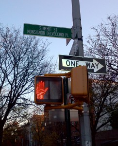
This next one hits close to home because, well, it’s close to my home. We live on Summit Street. I’m not sure where that other name comes from, and I’ve never seen any address with “Monsignor Delvecchio Place” so I’m not sure why they need to share a sign. The only real effect of such small lettering is that most cabs and food deliveries drive right by it.
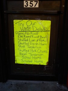
Here’s the beauty that I’ve decided to redo. This sign is taped (rather poorly…) to the door of a delicious deli. Their meats are actually delightful, but I wouldn’t believe the sign.
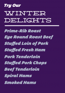
So here is my design. First, I’ve replaced the hand-written sign with one using a couple nice typefaces. I made the background colorful to still be eye-catching, although maybe not as much as the neon green. The items are lined up and given a slight bit of color, enough to stand out from the title. Take a look below and comments welcome
Leave a Reply