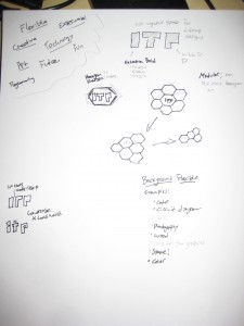
The next step of our homework assignment was to create a new ITP logo. I had been thinking about this all during the weekend so when I sat down with my pen and paper today I was ready to go. I started with brainstorming ideas about what ITP means to me and others. I wrote down things like Creative, Flexible, Technology, Art, Experimental, etc. I was very inspired by the flexible systems in my last post so I got to work.
I first thought about the typeface. I initially wanted to use the negative space, so I knew I’d need a chunky one. I decided on Helvetica Bold for the iconic shape and the weight. I then started thinking the flexibility. ITP stands for a lot of things to a lot of people, and everyone’s experience is slightly different. I wanted that to show in my logo and give users the ability to customize their logo for different use cases (such as business cards, etc.) Here’s what I came up with:
as I was making the pdf and scrolling through, I loved the way it looks as it flipped through the colors so I made an animated gif of it (Click to view):


Leave a Reply