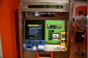
For this assignment, we were asked to pick a piece of interactive technology out in the wild, and observe people using it. I chose something that frustrated me at first, but as I’ve now memorized the actions needed, it no longer bothers me: The MetroCard vending machine.
The first issue I found (and observed others making the same error) was to assume that the two sizes of machines function the same way. This is not the case. At the smaller machine, (which does not take cash, by the way), you have the option to add money to your card directly after inputing your desired language. On the larger machines, you need to first select “MetroCard” then add fare.
I watched as tourists and locals used the machine. Most people who looked like locals to me were able to navigate the menus to their desired destination relatively quickly and confidently. Others, who I judged as less experienced with the machine, seemed to have troubles. They would stumble around the menus for a bit going back and forth and then look to their companions to see if they knew where to go or ask the attendant (if there was one present).
Another issue seemed to be the accuracy, or assumed accuracy of the touch screen. The touch layer is actually raised off the surface of where the information is projected by about half an inch maybe. Depending on the height of the user (and the angle they are looking) I saw many people miss buttons the first or second time. After reading Design of Everyday Things, this is an area where it seems like more affordances could be given. Instead of the touch screen that works some of the time, with squares as buttons, the machine could have actual buttons and a mapping to those on the screen.
Things that appeared clearly marked were how to insert a credit card and the MetroCard itself. I saw very few people put those in backwards or upside down, since the machine has very clear pictures on the proper way to insert them.
All told, the machines seem to function fairly well for those who use them often. Just from observation, and without knowing their actual usage patterns, it seems that the larger machines should have a quicker way to add money to an existing metroCard. From my observations, that was the most-used function. One potential solution I would propose is the ability to insert your MetroCard right away without pressing any buttons and take you directly to a screen with options for an existing card. Another way I would speed up transactions would be to assume the user wants to use English, but put a small icon with different flags in the corner for those who wish to use another language. The machines could even record usage patterns and assume a different language for machines that are used the majority of the time in another language.

Leave a Reply